🚟Tutorial: Rolling Out Flexbox Dashboards from Clean Slate
Goal: Adapting Clean Slate's Flexbox Dashboard Design
To add new dashboards, read the Technolutions KB article on Dashboards first.
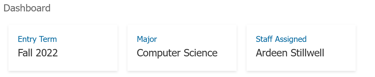
When you provision Clean Slate and open a record, you’ll often see a dashboard with tidy boxes, with headers and merge fields in a style that matches Slate’s native interface. These boxes use a responsive CSS framework called "Flexbox".
To help you use this design to kickstart your own dashboards, we created this brief tutorial.
Phase 1: Getting the code into your dashboards
You could, of course, Suitcase the dashboard out of Clean Slate and import the suitcase – but this is only helpful if the scope in Clean Slate matches the scope of your dashboard in your instance. If you want to go from Person to Organization, you'll need to follow these steps anyways.
- Open the Dashboard in Clean Slate.
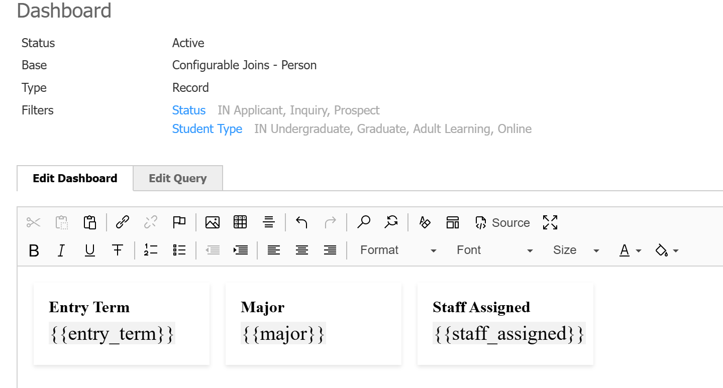
- On the “Edit Dashboard” tab (with the WYSISWYG editor), click on the Source Code icon.

- Highlight all of the HTML code on this page (Ctrl+A), then use Ctrl+C to copy the code.
- Open your own dashboard in your Slate (or create a new one!)
- Click the Source Code icon on your Edit Dashboard tab.
- Use Ctrl+V to paste in the code.

Now you have a template – let’s understand how to edit it.
Phase 2: Editing the code
2A – Add/remove/move boxes
The only way to move or add a flexbox box is by editing the HTML source code.
It's often helpful to click the “Maximize” button when working with source code in Slate![]()
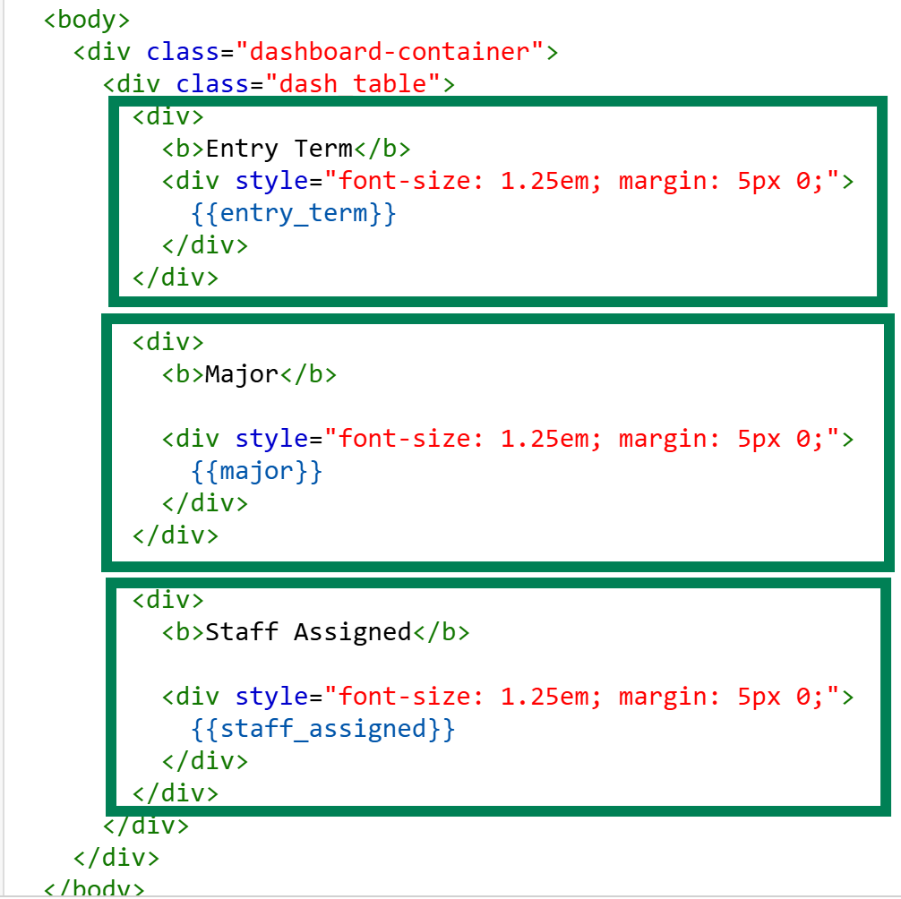
In your code, each one of these <div> tag groups is a box.
To add or remove a box, highlight all of the inner elements of a single box, and either delete (to remove) or use Ctrl+C and Ctrl + V to copy the design and insert a new box at your cursor (or copy this code).
        <div>
          <b>Entry Term</b>
          <div style="font-size: 1.25em; margin: 5px 0;">
            {{entry_term}}
          </div>
        </div>
To move a box, you’ll use Ctrl+X (cut) and then move your cursor above the box you want to move it before hitting Ctrl+V (paste).
2B - Edit the Content
Inside of each <div> box, there’s the same content pattern:
        <div>
          <b>Header Info Goes Here</b>
          <div>
            {{merge_fields_go_here}}
          </div>
        </div>
So, as you’re editing your dashboard, just make sure you keep those inner elements the same: put your header's inside of the <b></b> tags, and the merge fields inside of the <div></div> tags.
If you want your content to act as a URL, we recommend putting it inside of the<div></div> element tags.
2C - Changing the Style/Looks
Your copied dashboard came with some pre-designed CSS.
This set of CSS controls the BOX itself:
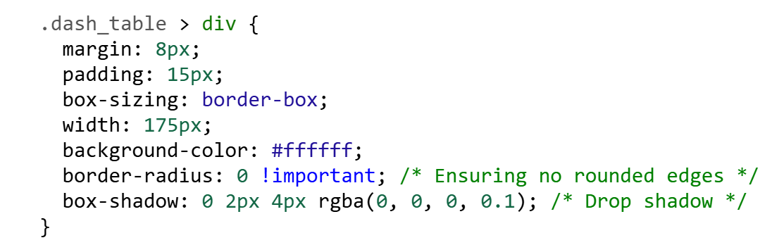
So, if you find the boxes to be too bulky, you can reduce the width (maximum size of each box) and the padding (padding is the cushion outside of your content - you want some cushion to improve readability, but too much can interfere with the UX).
If you want your boxes to have a different background color, simply put in a new color value in that element (try #f00 and see how shocking that looks!)
Play around with the values - this is how you learn!
If you want to edit the style of the content, you'll need to add your own CSS. For example, if you find the font too large, you can scale it down (the default code for the merge field element is actually configured as 125%, or 1.25em)
      .dash_table > div > div {
        font-size:100% !important;
      }
The !important addition to the CSS is actually important - otherwise, Slate will ignore your command and use the default CSS. But don't overuse !important.
This should get you started on customizing your own dashboards without having to invent your own designs, or have a strong background in HTML/CSS.
Reference: Josh's Slate Summit 2025 Presentation, Seeing Your Name in Lights.
No comments to display
No comments to display