📈Timeline Chart Configuration in Reports
Visualizing data in Slate with reports can be very helpful. Timeline charts are a specially built type of line chart that is among the most useful, because they show activity over a period of time, using a reference date, such as application submission date, enrollment deposit date, etc.
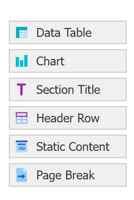
Unfortunately, these must be specially built, because you cannot just add a chart to your carefully built application funnel table report. Why? Because in a Slate Chart, the columns in a report become the individual lines, and on a table, you use columns differently. If you're anything like me, you'd end up with 20 lines on such a chart. Instead, create a new Report Part for your charts.
Typically, on a multiline chart, each line allows you to compare different groups. But a single-line chart is just as useful as a visual tool!
Types of Timeline Charts
There are three types of timeline charts in Slate (called functions) - default (day/month), cumulative, and fiscal day.
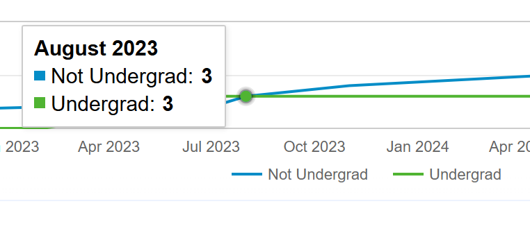
Default Timeline
Each day or month is an individual point on the graph, and displays the sum of matching records for that individual day/month. With day, this can get out of hand with ridiculous variation and peaks/valleys... but with month, it can show trends spectacularly.
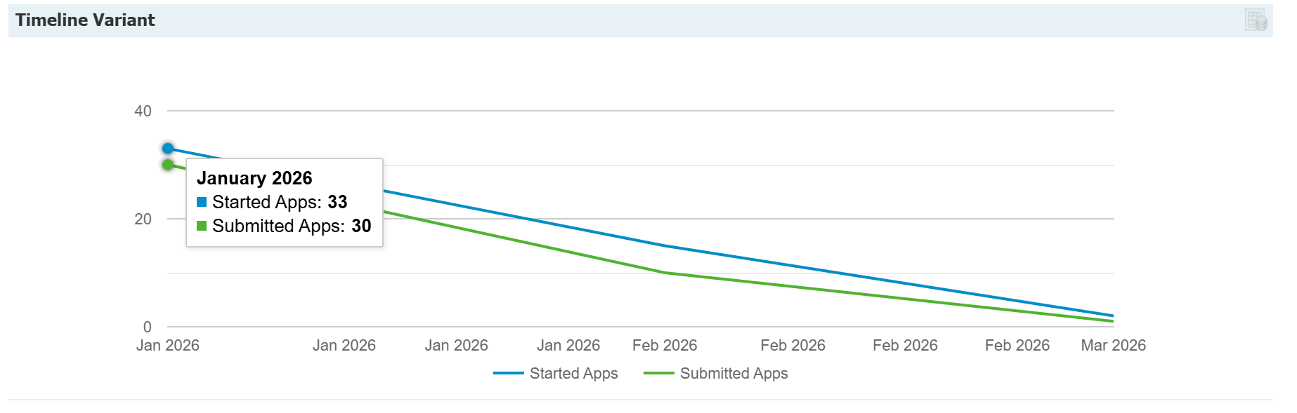
*Note - if you have oddball data - like a Fall 2026 application submitted on January 1, 2024 - then the timeline will try to start on January 1, 2024 - which is wayyyy before the rest of the applications appear.
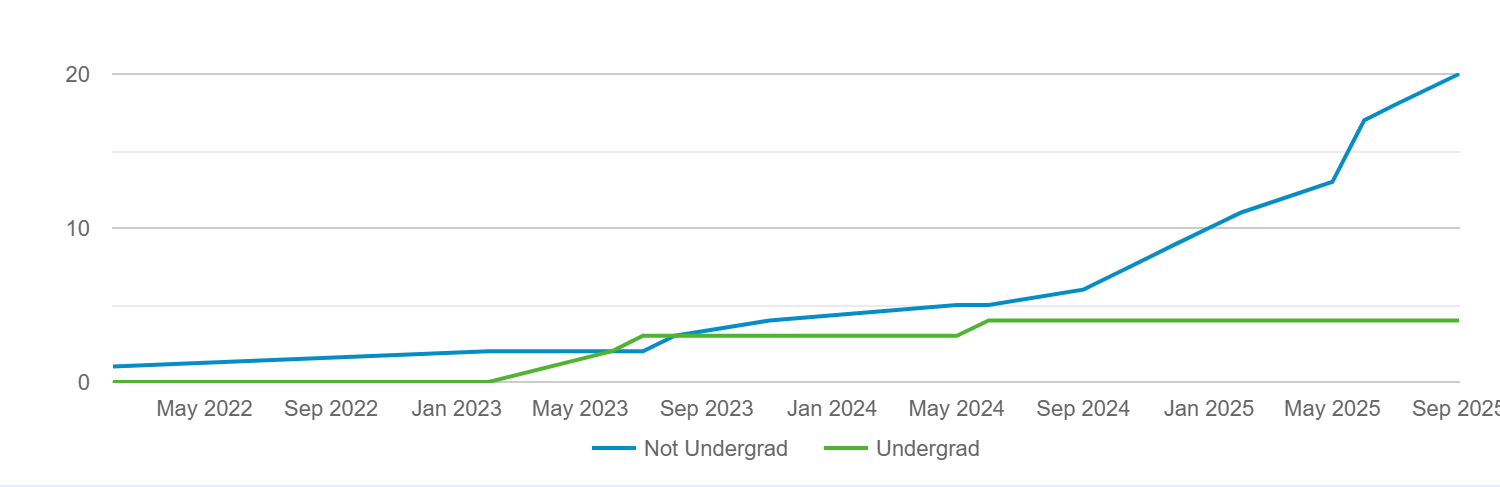
Cumulative Timeline
Each day or month's point on the graph is the sum of matching records for that individual day AND all prior days.
Fiscal Day of Year / Fiscal Day of Year (Cumulative)
These are used to limit a chart to only show a single 12 month period, and is designed to allow you to compare two different years as your column/lines. In theory, this sounds really neat, but it is difficult and narrow to execute this if the date you are using as a group-by reference spans a length of time more than year, which is common at rolling admissions institutions.
Building a Timeline Chart
First, add a chart as a new your report row (remember, earlier we recommend also adding a separate Report Part from any pre-existing tables):
From here, there are 3 basic components:
- Chart function configuration - where you choose your style
- Column (line) configuration - where you choose your populations to display as individual lines
- Group by date configuration - where you pick your date that you are tracking the populations on
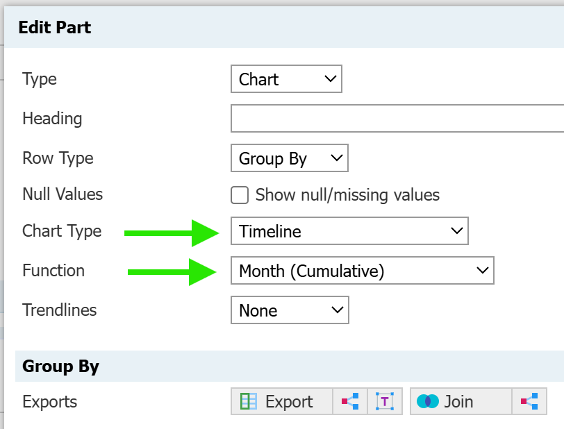
Chart Function Configuration
Briefly outlined here (and above), you select:
- Chart Type: Timeline
- Choose your Function (the "type" of timeline chart): Day, Day (Cumulative), etc.
Column Configuration
As noted above, you must define your columns carefully. Comparing major or student types is an easy win.
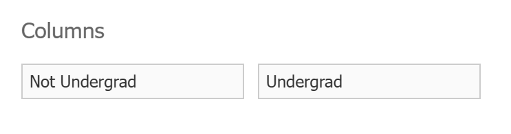
And translates to two different line values:
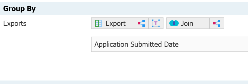
Group by Date Configuration
You must put an export value in the group by that is a date field for this to work as expected: Submitted date, Decision date, Registration date, etc.
This is where you truly decide what you want your report to show.
No comments to display
No comments to display